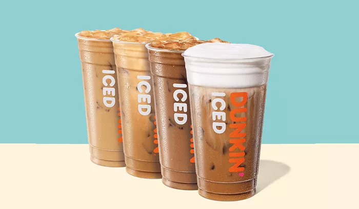
April 30, 2025 — Dunkin’ stirred up a lively discussion online this week after posting a chart that showed seven shades of iced coffee, each representing a different level of cream.
The image, shared on Instagram on Tuesday, April 29, displayed cups ranging from black coffee (labeled as “1”) to the lightest, creamiest version (labeled as “7”). In the caption, the company joked, “You did NOT wanna see number 8,” suggesting that even creamier options exist off the chart.
The post quickly went viral, as fans flooded the comments with opinions on the “perfect” coffee color. Many leaned toward the middle of the spectrum.
“4 is when I know it’s gonna be a good day,” one user wrote. Another insisted, “4 or 5 and don’t even start with me.” A third fan chimed in, “A 4 is a dream, but I’ll happily take a 5 any day.” Someone else described 5 as “chef’s kiss.”
But not everyone agreed.
Some preferred their coffee much darker. One user noted, “1 or 2 only,” while another commented, “Anything above a 4 is embarrassing.” A different fan added, “NUMBAH 2!!!! Little splash of sum… rest of y’all need to lay off the dairy.”
On the other end of the spectrum, one Instagram user admitted, “I want to see 8, because that’s probably my coffee.”
Several commenters also took the opportunity to call out their local Dunkin’ stores.
“4 !!! Dunkin needs to quit giving me 7s,” one person wrote. Another replied, “Thank you!! I always get 7s when I want a 4 or 5.” A third suggested, “This chart needs to be a reference at all locations. Ordering by this would actually be amazing.”
Dunkin’ has not yet responded to the suggestion, but the conversation continues to brew across social media.
Related topics:


